that I'm working on a very interesting project that is designed to lead
to some important changes in behavior that has already had dramatic
impacts. But we want to do even better and so we are studying some
parallel offerings and what they are doing relative to promoting
specific behavior in their systems.
Ultimately, we are trying to design something that will motivate users
to take action that we know will have positive impact. However, there's
often this gap between what people know they should do and getting them
to actually do it (and that's not just with online systems).
I'm reviewing: Khan Academy, Nike Training Club and SparkPeople.
I've included lots of screen shots of what I'm seeing and some thoughts
as I'm going through them. I'm not claiming this is scientific in any
real way. Rather, I'm collecting some thoughts in terms of design
concepts.
I would very much welcome feedback/comments on this:
- What else have you seen or used that motivates action in online systems for behavior change?
- What articles have you seen that talk about use of goals, badges, points, community, etc. for motivating user action?
Khan Academy
Nice walkthrough of your profile, but interestingly it didn't take me into it automatically.
Provides an interesting concept in terms of allowing users to earn
points to be able to change their avatar. Similarly, it shows you holes
where badges would go. Suggested activities with progress indicator
and easy click to access. Shows recently completed activity and rewards
earned.

Tons of Badges and explanation of the badges:

Nice statistics.

I will say that I found the content presentation to be fairly standard.
It uses very familiar voice/language that makes it feel comfortable.
But there wasn't anything that special or different about it.

Practice was also not all that different and generally was very simple.
The system does have a good use of progress indicators. And it also
has very simple, consistent format.

Each practice results in rewards and clear indication of how to move
on. Uses longest streak, quick answers and total leaves (points).

Shows you how to use it in your classroom.

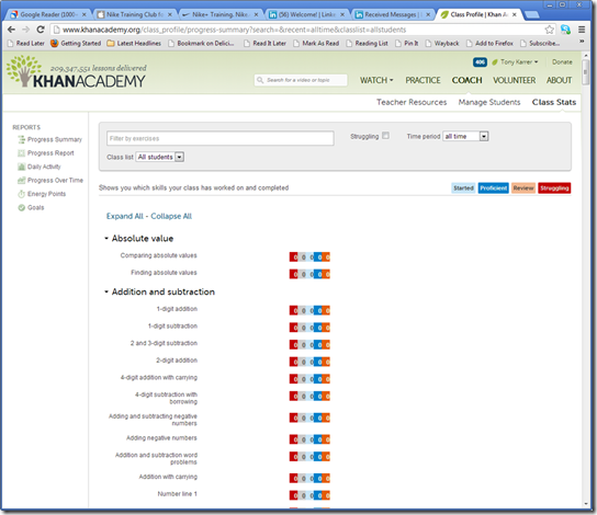
Teachers can setup students in the system so that they can get reports on their progress.

Can see stats easily on your class to determine how they are doing. As a
teacher, this could be a great tool to help figure out where you might
want to spend more time. The interface is really easy to understand.
Nike Training Club
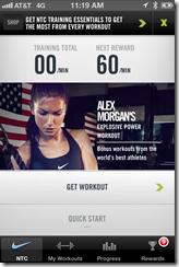
This happens to be a program that my wife and daughter love. Its veryeasy to get into and start using. Choose your goal then your level.
Then your workout.


You can see pictures and videos ahead of time or while you are doing it.
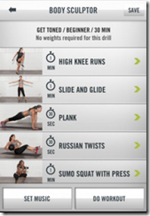


Don't forget to plan your music that goes along with the workout.

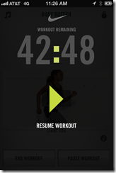
During the workout, it's easy to understand what's going on. There are
voice commands that give you pointers and count down just like a trainer
would.

There's a nice summary of your workout at the end.

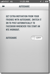
You can automatically share your workout with friends.

The system really excels in terms of stats and rewards.


SparkPeople
Quick call to action to sign-up.
Step 1 - setting goals

Window expanded based on entered goals to see what your planned goals
turned into. You can see the specific plan elements and easily change
your goals on the same page.


Time to enter a bunch of preferences, its not clear how this impacts my
experience. Even after using the system for a while, it wasn't clear to
me. Likely it would have put me into additional teams (smaller forums -
described below).


I'll be honest, its way too hard to use food trackers like this for me.
In this case, I tried typing in what I had for breakfast and it didn't
come up with a reasonable choice. What no normal Raisin Bran cereal.
It took me a bunch of tries to find that I needed to type in the brand
of cereal first. Entering the sandwich I made for lunch. Way too much
work for me personally, but I understand the value.

Same interface for tracking fitness, but so much easier to enter because there are a LOT fewer items.

Periodically you get a pop-up or other calls to action around the points.

Ugly ad right in the middle:
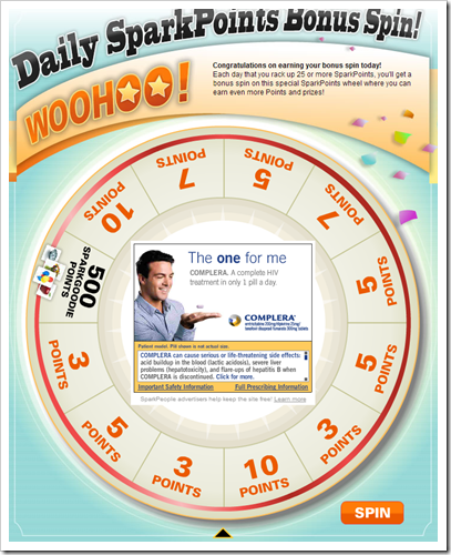
I won 3 points:

I'm not sure I buy this aspect of points, but I do think they've done a
great job using a menu of actions along with associated points that
basically motivate you to do the things that will be good for you to do
on the system. For example, posting in the forums earns you points.
Tracking each food item earns you points. Maybe this would get me to be
willing to spend the time on each item.


They also use this same approach to get you to try out additional features or refer other people.

SparkPeople makes heavy good use of streaks as a motivational tool.
These tie back to points and basically help to motivate daily use. Of
course, you get to cheat on most things by going back to previous days
and entering values to keep your streaks alive.

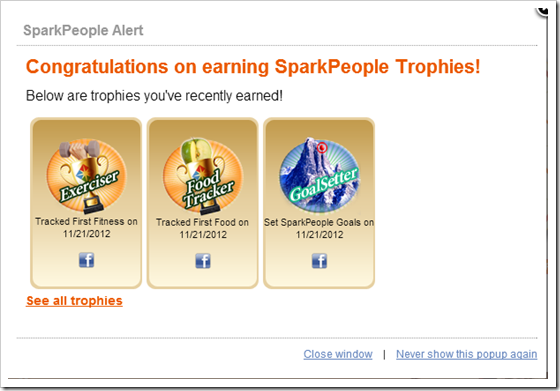
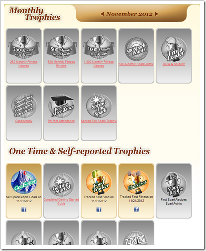
Also can earn trophies, which I've been calling badges on other other
sites. Like the other sites, its easy to see what badges are possible
and to find out what it will take to earn additional badges. It's
interesting to see that they use both badges and the central points
mechanism. I wonder if this gets lost a little.
SparkPeople does a lot of things to get people to interact with other users. It starts with automated personal emails.

And lots of use of community. You can see they have teams, message
boards, challenges, member tips, member pages, member blogs, member
success stories, and featured items. You could easily spend a lot of
time just in the community. It also could be a bit overwhelming for
first time users. So, they have done some nice things to help first
timers get started. This is key as most users do not jump in and start
communicating.

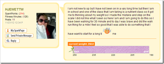
Automatically add you into a few teams. For example, all the people who joined the same week I joined.

People somewhat automatically share aspects of what they are trying to achieve.
Design Aspects
There are some interesting common items between the systems.- Badges / Trophies are shown as gray until its filled in with color
when you earn it. Each makes it clear what is required to earn the
item. - Each system offers early rewards and it steps up in complexity from there.
- Streaks are used in Khan and SparkPeople as additional incentives.
Obviously, SparkPeople has somewhat thrown everything at the user,
hasn't worried as much about the look of the interface, but has done a
few things that stand out to me in terms of design:
- Establish a clear goal around weight loss and possibly some other
goals. It's interesting to me that setting a goal is not much of a part
of Khan or Nike. In some ways, the broader efforts of Nike with Nike+
helps with longer term perspective. There's an implicit goal in Khan
Academy in terms of completing content. Still there's something good
about establishing a longer-term goal. Of course, then you need to
break it down into smaller goals. That's something that SparkPeople
does really well with Points. - Points as a central theme. The menu of actions that have points
directly tied to them is a great idea. This is a good way to provide
structured actions that tie back to the central motivational scheme.
Khan also provides points as a motivator. Interesting, points don't
really get me much in SparkPeople, but in Khan I can do simple things
like changing my avatar. - Lots of community options and a good job drawing people into the
community. Nike does a little of this with posting to your friends
about your workout. Again, looking at Nike+ more broadly they are doing
some interesting things around community. Still the Nike Training Club
is somewhat isolated.


No comments:
Post a Comment